How to code Linkedin style Donut chart
If you are learning D3.js and data visualization, this blog is going to help a lot. I am going to explain here, how to code a LinkedIn-style donut/pie chart.
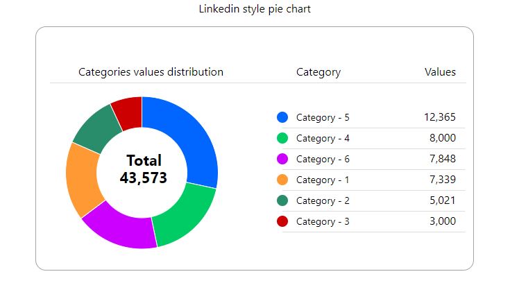
Let’s first understand what Linkedin actually delivers and how does the pie chart looks like there.
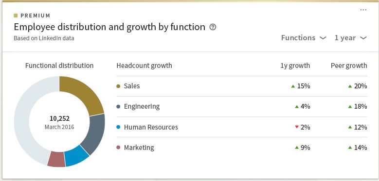
How neat and clean it does look, seems like the best utilization of screen space to show a pie chart. Linkedin has used a tricky design to show a pie chart rather than use an old-school representation of a pie chart. see the image below of a typical pie chart we used to create in a BI tool or even in Microsoft Excel, PowerPoint, etc.
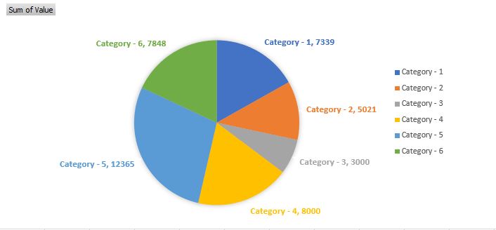
The image above is showing, how much space a pie chart can occupy when we scattered the data labels, to make it look like a flower. It seems LinkedIn is a clear winner here to make the user comprehend his/her data in the best possible way that too using a pie chart with a different design approach. Let’s understand what they have in the design, and how we can break things to recreate using D3.js.
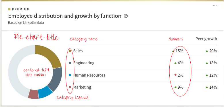
As I did a sketch on the Linkedin pie chart, we see several design components underneath. First of all, we don’t need a pie chart, we need a pie chart with a big white hole in the center, yes you name it a Donut chart. second, we have to show numbers and text here and there, not just scattered, but nicely organized in tabular format, and of course a big total number text on our pie chart belly.
Let’s begin!!
What type of data do we need to draw such a donut chart?
The above images tell the story themselves, all we need is two-column-based data points, simply saying, 2 columns with 6 rows, might be more, one should be category name, and the other one is the value. I am going to use JSON format data for this design. below is the sample data code of the Data.json file.
[
	{
		"CATEGORY": "Category - 1",
		"VALUE": "7339"
	},
	{
		"CATEGORY": "Category - 2",
		"VALUE": "5021"
	},
	{
		"CATEGORY": "Category - 3",
		"VALUE": "3000"
	},
	{
		"CATEGORY": "Category - 4",
		"VALUE": "8000"
	},
	{
		"CATEGORY": "Category - 5",
		"VALUE": "12365"
	},
	{
		"CATEGORY": "Category - 6",
		"VALUE": "7848"
	}
]
What does our code hold?
Including the above Data.json file, we need 3 more files, index.html, stylesheet file style.css, and our hotcake d3.js code file LinkedinPieChart.js to write a small application to achieve a pie chart.
Index.html file, where we will plot our pie chart. we need a <div> tag with id “LinkedinPieChart” in index.html file. on this div using the id marker, D3.js code will render all the design groups, components, and pie chart. basically, we are defining an area on our HTML webpage, which D3.js code should utilize to show our design.
No need to forget, we need d3.js library CDN and our LinkedPieChart.js path in this file. see the line 15 and 16 below.
<!DOCTYPE html>
<html lang="en">
<head>
  <meta charset="UTF-8">
  <meta name="viewport" content="width=device-width, initial-scale=1.0">
  <title>Linkedin Style Pie Chart</title>
  <link rel="stylesheet" type="text/css" href="style.css" />
</head>
<body>
    <center>
    	<div id = "LinkedinPieChart">
			<center><p>Linkedin style pie chart</p></center>
		</div>
	</center>
  <script src="https://d3js.org/d3.v6.js"></script>
  <script src="LinkedinPieChart.js"></script>
</body>
</html>
style.css file, just to keep styling content of the pie chart, like font size, font family, main area border, background color, etc.
*{
	font-family:"Segoe UI",Arial,sans-serif
}

.svg-area
{
  background-color: #fff !important;
  border:1px solid #a3a3a3;
   border-radius: 15px;
  color:#272727 !important;
}
D3.js Code
Below is the code we are going to write in our LinkedinPieChart.js file.
//Funtion to convert numbers into Indian writing format
function indian_format(num)
{
     var x=num;
    x=x.toString();
    var lastThree = x.substring(x.length-3);
    var otherNumbers = x.substring(0,x.length-3);
    if(otherNumbers != '')
        lastThree = ',' + lastThree;
    var res = otherNumbers.replace(/\B(?=(\d{2})+(?!\d))/g, ",") + lastThree;
    return res;
}

async function drawPieChart()
{
	var dataset = await d3.json("data.json");

    //console.log(dataset);

    var category_dataset = d3.rollups(dataset, v => d3.sum(v, d => d.VALUE), d => d.CATEGORY);
    category_dataset.sort((a,b) => d3.descending(a[1], b[1]));

    var catCount = category_dataset.length;

	var catSum = indian_format(d3.sum(category_dataset,d=>d[1]));

    // Category Colors
    var catColors = ["#0066ff","#00cc66","#cc00ff","#ff9933","#298d6c","#cc0000"];

    //Area Dimensions
    var dim = {
        width:630,
        height:350,
        margin:{
            top:10,
            bottom:0,
            left:10,
            right:10
        }
    }

    dim.ctrWidth = dim.width - dim.margin.left - dim.margin.right;
    dim.ctrHeight = dim.height - dim.margin.top - dim.margin.bottom;


    // Accessor Functions:
    var categoryNameAccessor = (d) => d[0];
    var categoryValueAccessor = (d) => d[1];


   	 //Parent SVG
     var svg = d3.select('#LinkedinPieChart')
     .append('svg')
     .attr('width',dim.width)
     .attr('height',dim.height)
     .classed('svg-area',true);

     //container 1 for pie chart
     var ctr1 = svg.append('g')
     .attr('transform',"translate(" + dim.ctrWidth / 4 + "," + (dim.ctrHeight/2+40) + ")");

     //container 2 for side data table
     var ctr2 = svg.append('g')
     .attr('transform',`translate(${dim.ctrWidth/2+50},100)`);

     //container 3 for top labels
     var ctr3 = svg.append('g')
     .attr('transform',`translate(20,80)`);

    //Print upper headers.
    ctr3.append("text")
        .text("Categories values distribution")
        .attr("x",250)
        .attr("y",-10)
        .attr("text-anchor", "end");

    ctr3.append("rect")
        .attr("width",dim.ctrWidth-10)
        .attr("height",1)
        .attr("x",0)
        .attr("y",0)
        .attr("fill","#ddd");

    ctr3.append("text")
        .text("Category")
        .attr("x",dim.ctrWidth/2+50)
        .attr("y",-10)
        .attr("text-anchor", "start");

    ctr3.append("text")
        .text("Values")
        .attr("x",dim.ctrWidth/2+280)
        .attr("y",-10)
        .attr("text-anchor", "end");

    // Build the pie chart:Using arc function

    // Compute the position of each group on the pie:
     var pie = d3.pie()
      .value((d)=>categoryValueAccessor(d));

    var data_ready = pie(category_dataset);

    // set the color scale
    var catColora = d3.scaleOrdinal()
    .domain(category_dataset)
    .range(catColors);

    ctr1.selectAll('rect')
	  .data(data_ready)
	  .enter()
	  .append('path')
	  .attr('d', d3.arc()
	    .innerRadius(65)
	    .outerRadius(110)
	  )
	  .attr("fill", (d,i)=>catColora(data_ready[i].index))
	  .attr("stroke", "white")
	  .style("stroke-width", "1px")
	  .append("title")
	  .text((d,i)=>data_ready[i].data[0]+" : "+indian_format(data_ready[i].data[1]))
	  .style("opacity",`0.7`);

	 var pieCenterText =  svg.append('g')
	 .attr('transform',"translate(" + ((dim.ctrWidth/5)+8) + "," + ((dim.ctrHeight / 2)+30) + ")");

	 pieCenterText.append("text")
	 .style("font-size",`22px`)
	 .style("font-weight",`bold`)
	 .text("Total");

	 pieCenterText.append("text")
	 .style("font-size",`22px`)
	 .style("font-weight",`bold`)
	 .text(catSum)
	 .attr("x",25)
	 .attr("y",25)
	 .attr("text-anchor","middle");

	  // print side table
      var groups=[];
	  for(var i=0;i < category_dataset.length;i++)
	  {
	  	groups[i] = ctr2.append('g')
		.attr('transform',`translate(0,${i*(30)+25})`);

        // to print legends circles
		groups[i].append("circle")
		.attr("r",8)
		.attr("cx",0)
     	.attr('cy',5)
     	.attr("fill",catColora(data_ready[i].index));

     	// to print Category text
        groups[i].append("text")
     	.text(data_ready[i].data[0])
     	.attr("x",20)
     	.attr("y",10)
        .attr("style",`font-size:14px;`);

     	// to print Category numbers
        groups[i].append("text")
     	.text(indian_format(data_ready[i].data[1]))
     	.attr("x",250)
     	.attr("y",10)
     	.attr("text-anchor", "end");

     	// to print line seperator
        groups[i].append("rect")
     	.attr("width",dim.ctrWidth/3+60)
     	.attr("height",1)
     	.attr("x",0)
     	.attr("y",20)
     	.attr("fill","#ddd");
	  }

}
drawPieChart();
Line 14-16: Async Function
First of all, we need a function drawPieChart() to do all the coding. second, this function should be an async function, why? because we are going to load our data from Data.json file which needs a promise-based call, and await until the data is loaded and stored in a javascript variable. if you want to understand the uses of async and await, I recommend reading about it here.
async function drawPieChart()
{
	var dataset = await d3.json("data.json");
Line 20-28: The key variables
We need here one array data set to hold our data in a format compatible with the pie chart, we are using a rollups function here to modify our dataset var and then doing sorting on data based on the “VALUE” parameter so that the arc on pie chart can be sized accordingly. the grouping and sorting of data for the pie chart are very important. want to learn more about rollup, group, index, and other cool functions from D3, you can read here. in the end, we have catColors array, which holds the colors we are choosing for pie chart arcs. you can decide the order and hashcodes for the colors, but it follows 0 to the array limit, for the values in decreasing order.
var category_dataset = d3.rollups(dataset, v => d3.sum(v, d => d.VALUE), d => d.CATEGORY);

category_dataset.sort((a,b) => d3.descending(a[1], b[1]));

var catCount = category_dataset.length;

var catSum = indian_format(d3.sum(category_dataset,d=>d[1]));

// Category Colors
var catColors = ["#0066ff","#00cc66","#cc00ff","#ff9933","#298d6c","#cc0000"];
Line 30-40: Defining rendering area
The codes below are defining a dim(short for dimensions) JSON array that holds basic dimensions of the rendering area, where SVG graphics (Pie chart, text, numbers everything) would be hooked.
//Area Dimensions
    var dim = {
        width:630,
        height:350,
        margin:{
            top:10,
            bottom:0,
            left:10,
            right:10
        }
    }

    dim.ctrWidth = dim.width - dim.margin.left - dim.margin.right;
    dim.ctrHeight = dim.height - dim.margin.top - dim.margin.bottom;
Line 46-48: The Accessor functions
Accessor functions are crucial in javascript and D3.js. theses pseudo functions are pre-defined function definitions, where we can pass the caller and the parameter at the time of the function call. In simple terms, we are defining a function variable so that these functions could help us to access each individual value of the “CATEGORY” and “VALUE” parameter of the “catagory_dataset” array.
// Accessor Functions:
var categoryNameAccessor = (d) => d[0];
var categoryValueAccessor = (d) => d[1];
Line 51-68: The foundation of SVG
Here we have defined three SVG elements, one is the main svg container and 3 groups named ctr1, ctr2, ctr3 using the dim array we defined earlier.
     //Parent SVG
     var svg = d3.select('#LinkedinPieChart')
     .append('svg')
     .attr('width',dim.width)
     .attr('height',dim.height)
     .classed('svg-area',true);

     //container 1 for pie chart
     var ctr1 = svg.append('g')
     .attr('transform',"translate(" + dim.ctrWidth / 4 + "," + (dim.ctrHeight/2+40) + ")");

     //container 2 for side data table
     var ctr2 = svg.append('g')
     .attr('transform',`translate(${dim.ctrWidth/2+50},100)`);

     //container 3 for top labels
     var ctr3 = svg.append('g')
     .attr('transform',`translate(20,80)`);
Why we have created 3 controller groups and one SVG holder, let me explain you in the below image, it will be more clear.
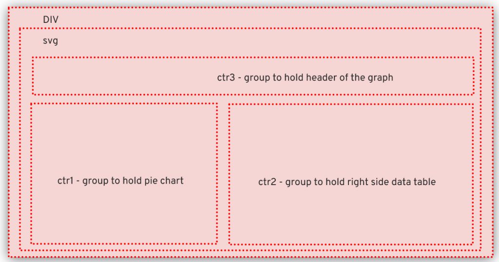
As you can see, div is our main container inside that we have another d3 container SVG then we have defined 3 groups to hold different components like ctr1 to hold our pie chart, ctr2 to hold right side table, and ctr3 to hold upper text headers.
Line 96-122: The Pie chart
    // Build the pie chart:Using arc function

    // Compute the position of each group on the pie:
     var pie = d3.pie()
      .value((d)=>categoryValueAccessor(d));

    var data_ready = pie(category_dataset);

    // set the color scale
    var catColora = d3.scaleOrdinal()
    .domain(category_dataset)
    .range(catColors);

    ctr1.selectAll('rect')
	  .data(data_ready)
	  .enter()
	  .append('path')
	  .attr('d', d3.arc()
	    .innerRadius(65)
	    .outerRadius(110)
	  )
	  .attr("fill", (d,i)=>catColora(data_ready[i].index))
	  .attr("stroke", "white")
	  .style("stroke-width", "1px")
	  .append("title")
	  .text((d,i)=>data_ready[i].data[0]+" : "+indian_format(data_ready[i].data[1]))
	  .style("opacity",`0.7`);
These are the lines where the actual Pie(donut) chart is shaping up. D3 has a pie function to convert the dataset and add additional information to it. D3 paints the arc of a pie chart using a path controller. the path is the same as a line we draw in SVG. for the line you need x and y coordinates while for the path you need all the points and their coordinates which can collectively create a shape. in this case, the arc is a shape which a pie chart holds, we can say a pie chart is a combination of several arcs, created using a path controller of SVG. little tricky ha?
simply saying pie() function in d3 is generating information which will be used to draw several arcs and make them look like a donut chart on the screen. here catColora() function is using the scaleOrdinal() scale method of D3 to assign an order to each color based on the values we have. assign a color to each category to be shown.
Now our path points are ready, from lines 109 to 122 we are just plotting our arcs at the right places, using several methods/functions of the D3 library. until here our pie chart is ready. innerRadius() and outerRadius() are the functions where we are actually converting a pie chart into a donut chart.
Line 124-138: Donut chart center “Total Text”
var pieCenterText =  svg.append('g')
	 .attr('transform',"translate(" + ((dim.ctrWidth/5)+8) + "," + ((dim.ctrHeight / 2)+30) + ")");

	 pieCenterText.append("text")
	 .style("font-size",`22px`)
	 .style("font-weight",`bold`)
	 .text("Total");

	 pieCenterText.append("text")
	 .style("font-size",`22px`)
	 .style("font-weight",`bold`)
	 .text(catSum)
	 .attr("x",25)
	 .attr("y",25)
	 .attr("text-anchor","middle");
We need a big number at the belly of our donut chart. In the above code, we are using a text controller and positioning it at the center of the donut chart.
Line 140-175: Right side table
// print side table
var groups=[];
for(var i=0;i < category_dataset.length;i++)
{
	groups[i] = ctr2.append('g')
.attr('transform',`translate(0,${i*(30)+25})`);

        // to print legends circles
groups[i].append("circle")
.attr("r",8)
.attr("cx",0)
	.attr('cy',5)
	.attr("fill",catColora(data_ready[i].index));

	// to print Category text
groups[i].append("text")
	.text(data_ready[i].data[0])
	.attr("x",20)
	.attr("y",10)
.attr("style",`font-size:14px;`);

	// to print Category numbers
groups[i].append("text")
	.text(indian_format(data_ready[i].data[1]))
	.attr("x",250)
	.attr("y",10)
	.attr("text-anchor", "end");

	// to print line seperator
groups[i].append("rect")
	.attr("width",dim.ctrWidth/3+60)
	.attr("height",1)
	.attr("x",0)
	.attr("y",20)
	.attr("fill","#ddd");
}
These lines are painting category text, tiny circles(Legends), numbers, and the horizontal line separators for each category. Do you see the loop? yes, the for loop is iterating through all the categories in our data array. see catColora() function used again? this was an accessor function we defined earlier, now helping us to trace back the color assigned to each category. rest all are different d3 functions to do certain things. and below is our final output.
Line 1-12: Bonus function
I added a bonus function at the beginning of the code, from lines 1-12, indian_format() which converts any number to India format comma-separated number, just to improvise the code.
This blog was not meant to teach you D3.js but to help you understand the code used for developing Linkedin style Donut chart. I hope you enjoyed reading it and got something out of it.
Thank you, keep learning, keep reading, keep sharing!!